Mobile first: why we start with the phone
Why a website should be designed for the small screen first, and what that gives a business.
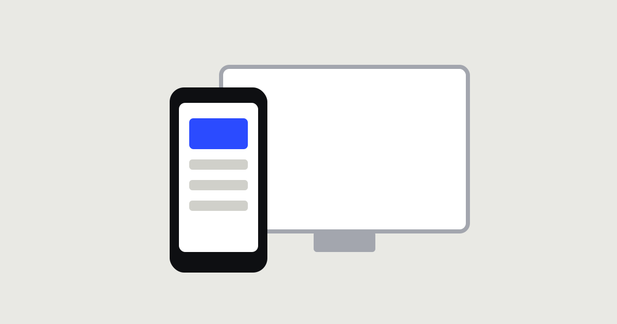
Most people see your website for the first time on a phone: on public transport, in a queue, between tasks. That’s why we design the mobile version first, rather than squeezing the desktop layout onto a small screen at the end.
What changes when you start with mobile
- Priorities become obvious. A small screen has no room for extras, so you have to decide what really matters.
- Buttons get easier to use. They are tapped with a finger, not clicked with a cursor, so they are bigger and placed within easy reach.
- Copy gets shorter. Nobody reads long paragraphs on a phone.
- The site gets faster. Mobile data doesn’t forgive heavy pages.
What about desktop?
It doesn’t go anywhere. On a big screen we simply add space and detail to a structure that’s already been thought through, instead of cramming a complex layout into a narrow column.
How to check your own site
Open it on your phone and try to find the prices and send an enquiry within a minute. If you had to zoom in on text or hunt for a button, there’s work to do.
The mobile version isn’t a shrunken copy of your website. For many clients, it is your website.